
In this lesson, students will use the inspiration of Dear Data to create an unique and accurate representation of their data after creating a more traditional bar or line graph.
- Objectives
- SWBAT generate and record data and use data to create a ‘traditional’ graph (bar graph or pie chart)
- SWBAT will create a more visually effective, artistic graph to convey the same data.
- SWBAT analyze and interpret data.
- Grades: 6 to 8
- Time: 8 to 10 50 minute class periods
- Author: N Hipps
Arizona Standards Engaged
7.SP.A.2 Use random sampling to draw inferences about a population.
7.SP.B Draw informal comparative inferences about two populations.
Science and Engineering Practices:
Cross cutting concepts: patterns; SEPs: analyze and interpret data, engage in argument from evidence, obtain/evaluate/communicate information.

Lesson Plan

Teaching Slides

Teaching Data Literacy With Creativity Article
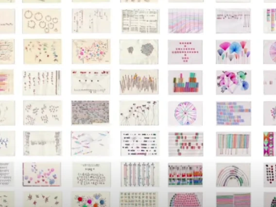
Dear Data Resources
Dear Data Website: https://www.dear-data.com/theproject
Dear Data Video Introduction (3 minutes): Big Bang Data: Dear Data